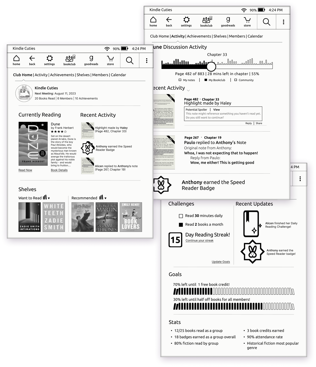
Explore books more deeply with friends with inline discussion, progress tracking, and bookclub management.
Context
Our team was challenged to solve for the brief
“How can Kindle become the preferred method of not only reading, but sharing progress
and reflections with others?”
Through user research we developed Kindle Book Club as a way to bring readers together on
the platform in a number of ways:
- in-line book annotations and discussion
- engagement over time with introduction of achievements and goals
- seamless integration into Kindle's existing UI
My Role
▸ UX Research and Product Design
user interviews, competitive analysis, concepting features, journey mapping, user flows,
usability testing
▸ Visual Design and Branding
developing and styling new features within Kindle's design system, icon illustration
Background and Goals
Amazon’s company vision for Kindle is “to make available in less than 60 seconds every book,
ever written, in any language, in print or out of print." The Kindle device is an eReader that
uses e-Ink technology. Its primary function is reading, though some models feature more
tablet-like functionality.
There are 30 million active users in the US alone, with 5x that sold globally (adoption in
China is on the rise: 26.1% of Chinese people–around 365 million individuals–have read an
ebook over the past year, compared to 23% of the US, it might be worth conducting testing of
this feature in the Chinese market).
People connect to their communities at large through sharing stories with each other. We
wanted to more deeply understand this connection so that we could leverage what we learn in
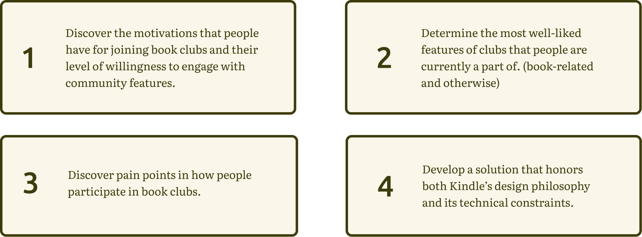
service of Kindle’s mission. Keeping that in mind, our team developed some goals:
Research Synthesis
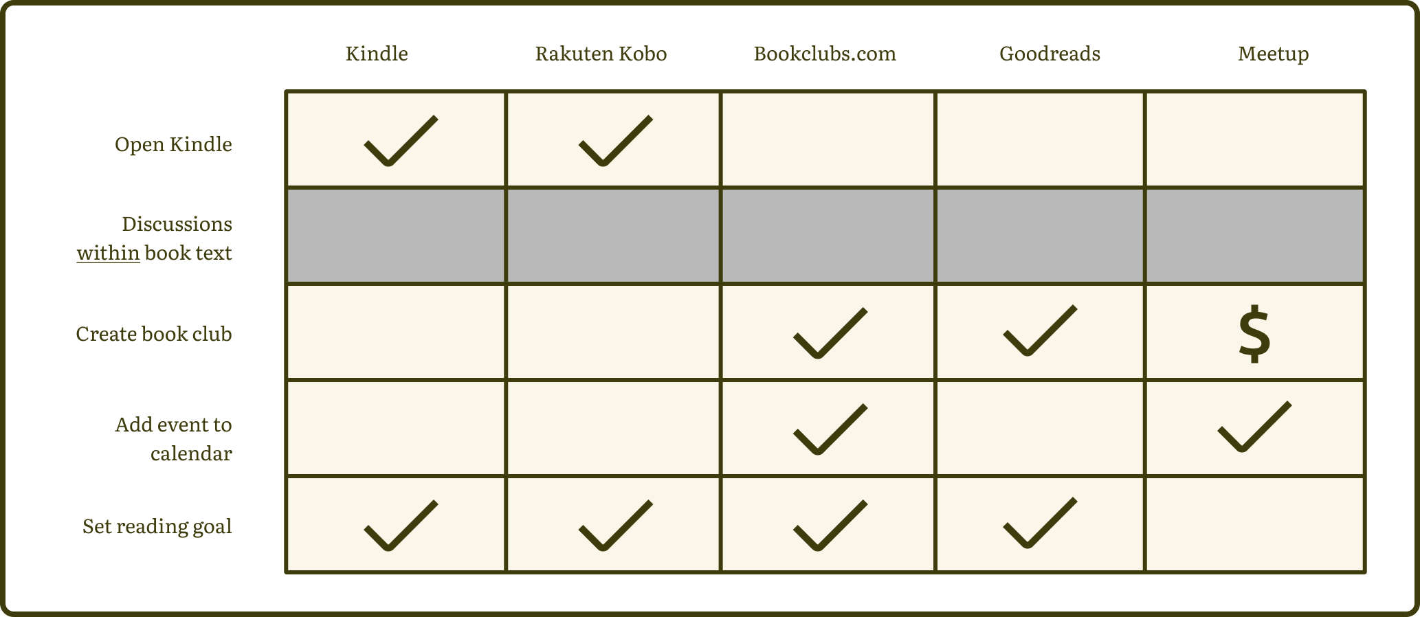
First things first–we need to figure some things out. We began research with competitive and comparative analysis to get a better sense of the eReading industry. We took a feature inventory of eReader devices, as well as other book club hosting sites or sites like Meetup that allow users to create online groups that meet virtually or in person.
Feature and Competitive/Comparative Analysis
We learned that no competing devices in the e-reading space let you have conversations with
others within the text of the book itself, and e-reading platforms offered very little
functionality specific to club organization, like scheduling meetings or setting group goals.
(Book clubbers we talked to turned to sites like Goodreads or Bookclubs.com to fulfill their
club management needs)
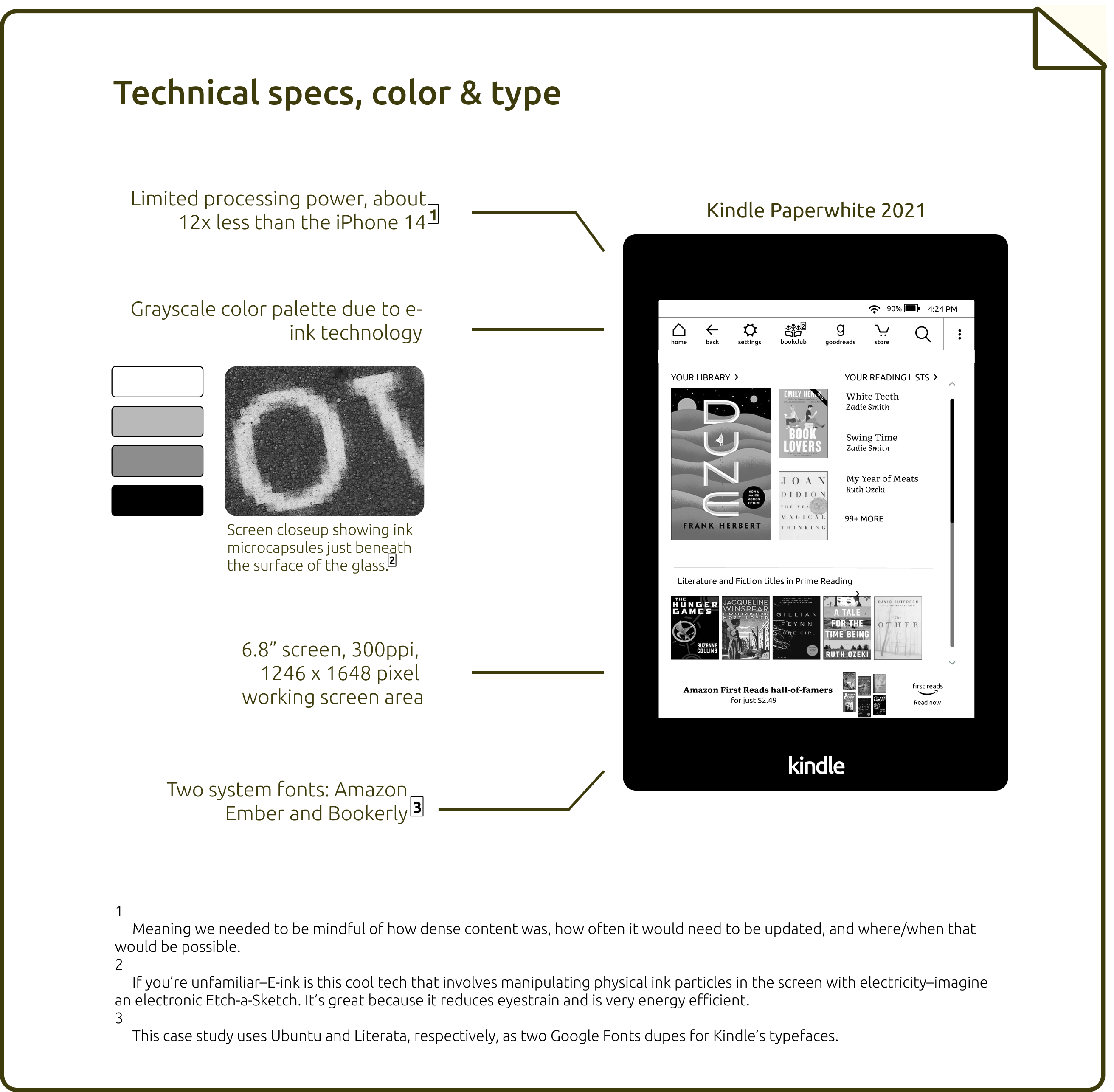
Through this process we realized that we would need to be prepared to solve for Kindle’s app/website or for the Kindle device itself. Knowing this, I began to study Kindle’s design conventions by recreating screens from the device in order to better understand how pages were constructed. Ultimately, these constraints were a big reason why we decided to design for the Kindle device itself rather than the Kindle app or desktop site. If we design for the simplest, least powerful hardware then our design should be easy to port to another platform. This led to some technical parameters that we could use later on in our solution:
User Interviews
Next, we needed to talk to some folks to understand how people are reading and book-clubbing
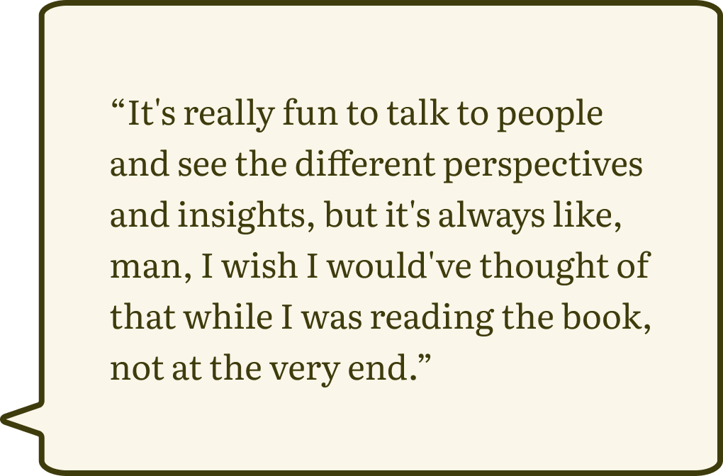
currently. We conducted 13 user interviews which revealed some common topics of interest:
1. Need for and difficulty in regular meeting times:

2. Impulse to elevate group discussion and expand it beyond scheduled meeting time:
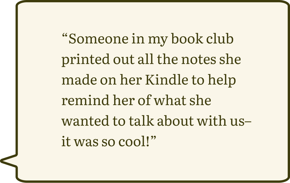
3. User workarounds that solve current pain points:
4. Love of reading and desire to share the lessons taught by books:

Defining the Problem
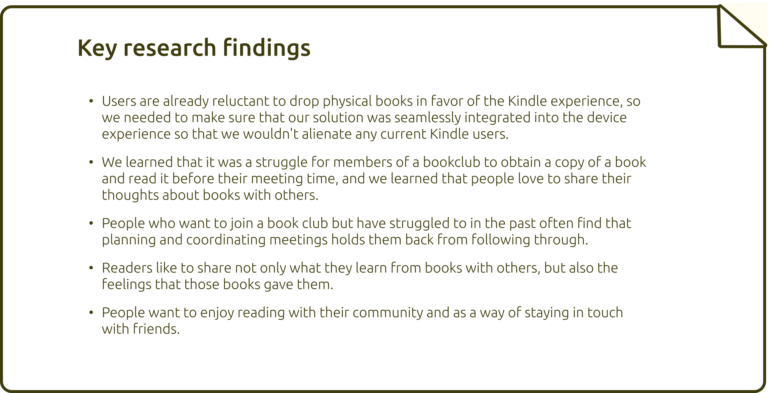
Let’s sum things up a little, shall we?
Building Personas
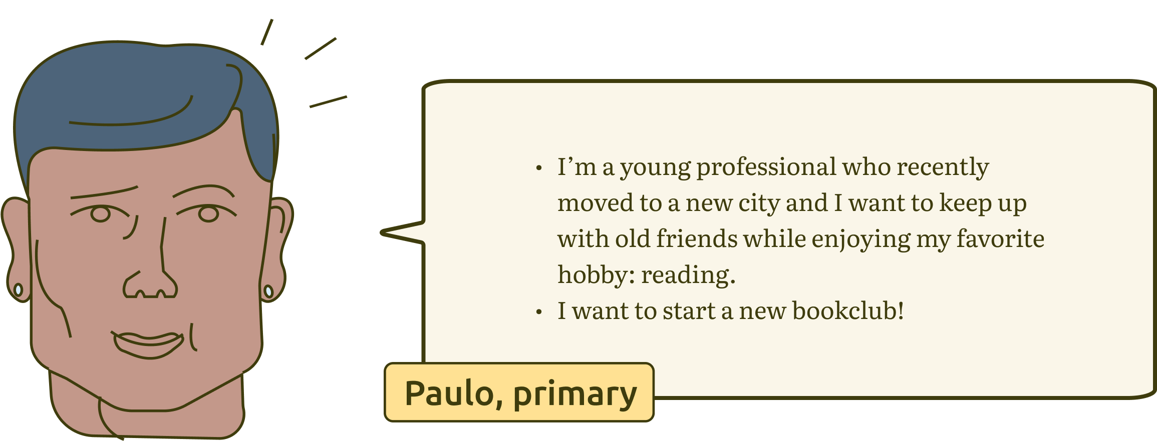
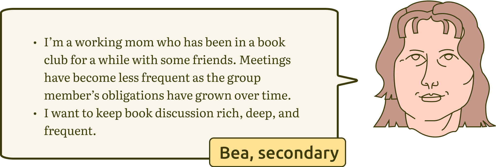
Using the results of our research we developed some personas–fictional people who represent a
very real group of users. Our team wanted them to feel nuanced enough to accurately represent
a believable user, while making their pain points and goals broad enough to ideate a solution
that solves for a lot of different users.
Though this process we were able to nail down more
clearly which pain points we could solve most effectively while keeping the requirements of
the brief in mind. We landed on club scheduling/management, seamless integration into daily
life, and keeping engagement high between official club meetings as important topics. These
are the resulting personas:

So what's the problem?
We synthesized our interview data into something more meaningful for our research. We did this
by grouping quotes and tidbits from our interviews into topic groups that were represented by
"I statements". This helped to clarify our research topics and understand what pain points and
goals came up the most often for our users. We isolated three main takeaways.

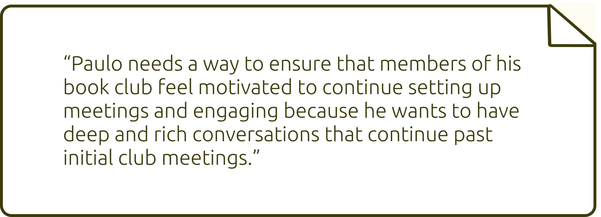
We acknowledged those findings in our final problem statement.
Designing the Solution
We revealed paths to possible solutions by writing “How might we...” questions. These allow for quick ideation while remembering our person’s needs, goals, and frustrations.
How might we...


From here it was just a matter of translating those ‘How Might We’s’ into user flows for relevant tasks.
Flows for user tasks1. Linking an existing bookclub

2. Leaving and responding to annotations

3. Setting goals and managing achievements

Keeping in mind the research and design constraints we found thus far, we developed our solution, Kindle Book Club. Without further ado...
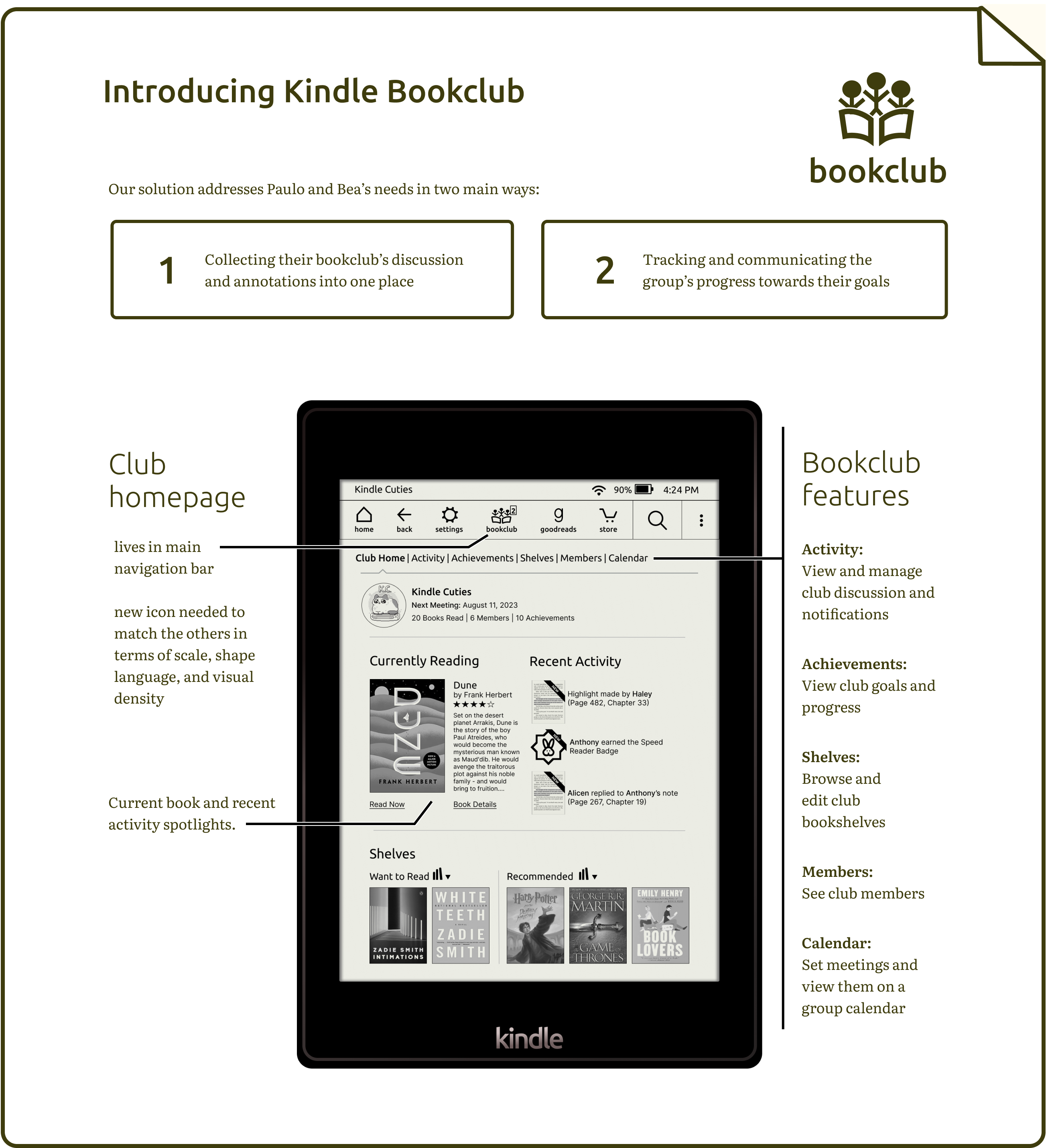
Bookclub Features
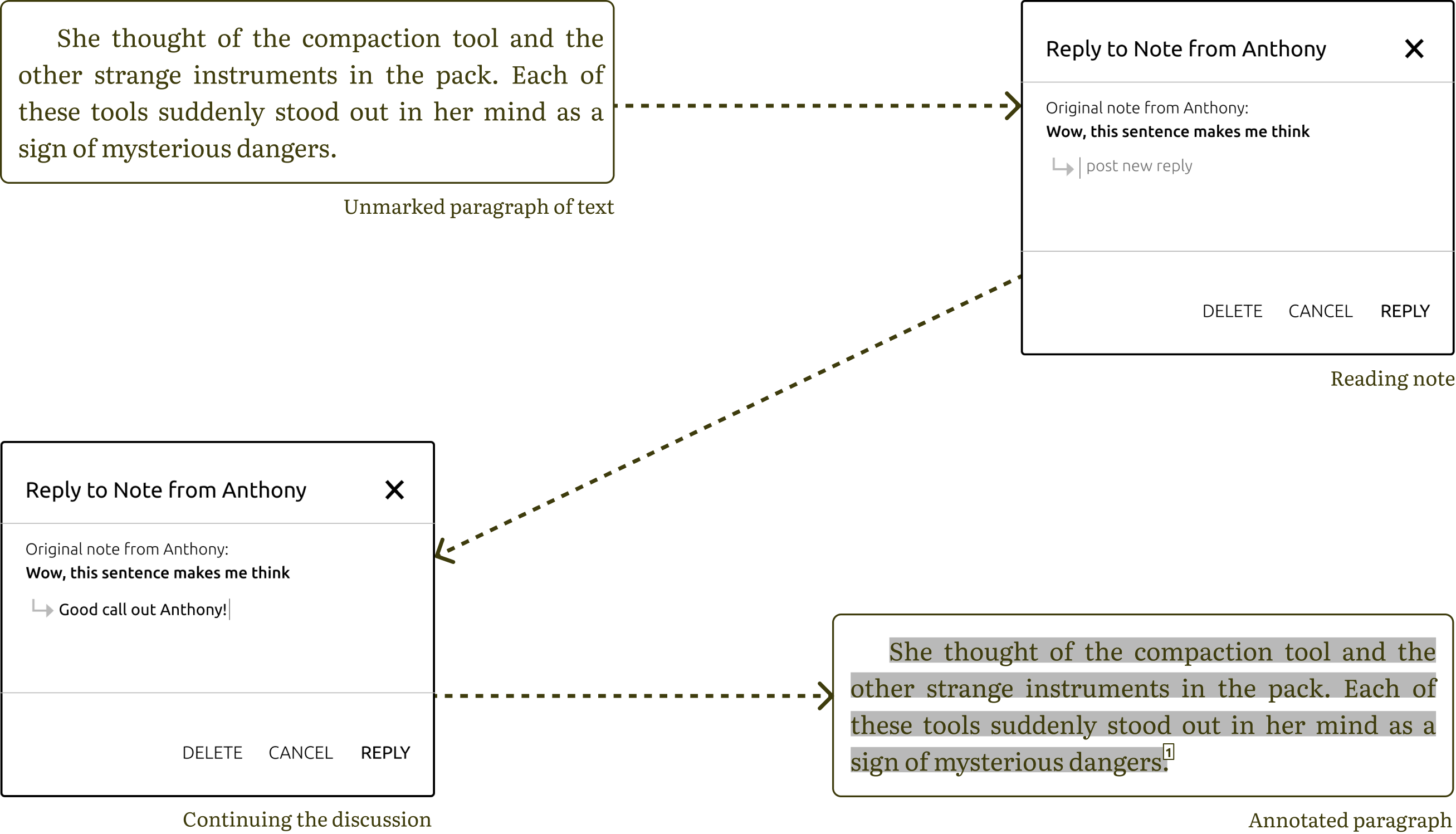
Inline annotation & discussion
This feature allows users to continue having exciting discussion in-between club
meetings–while never having to leave the text of the book! We expanded on Kindle’s existing
note taking capability by adding the ability for users to respond to annotations in a thread.
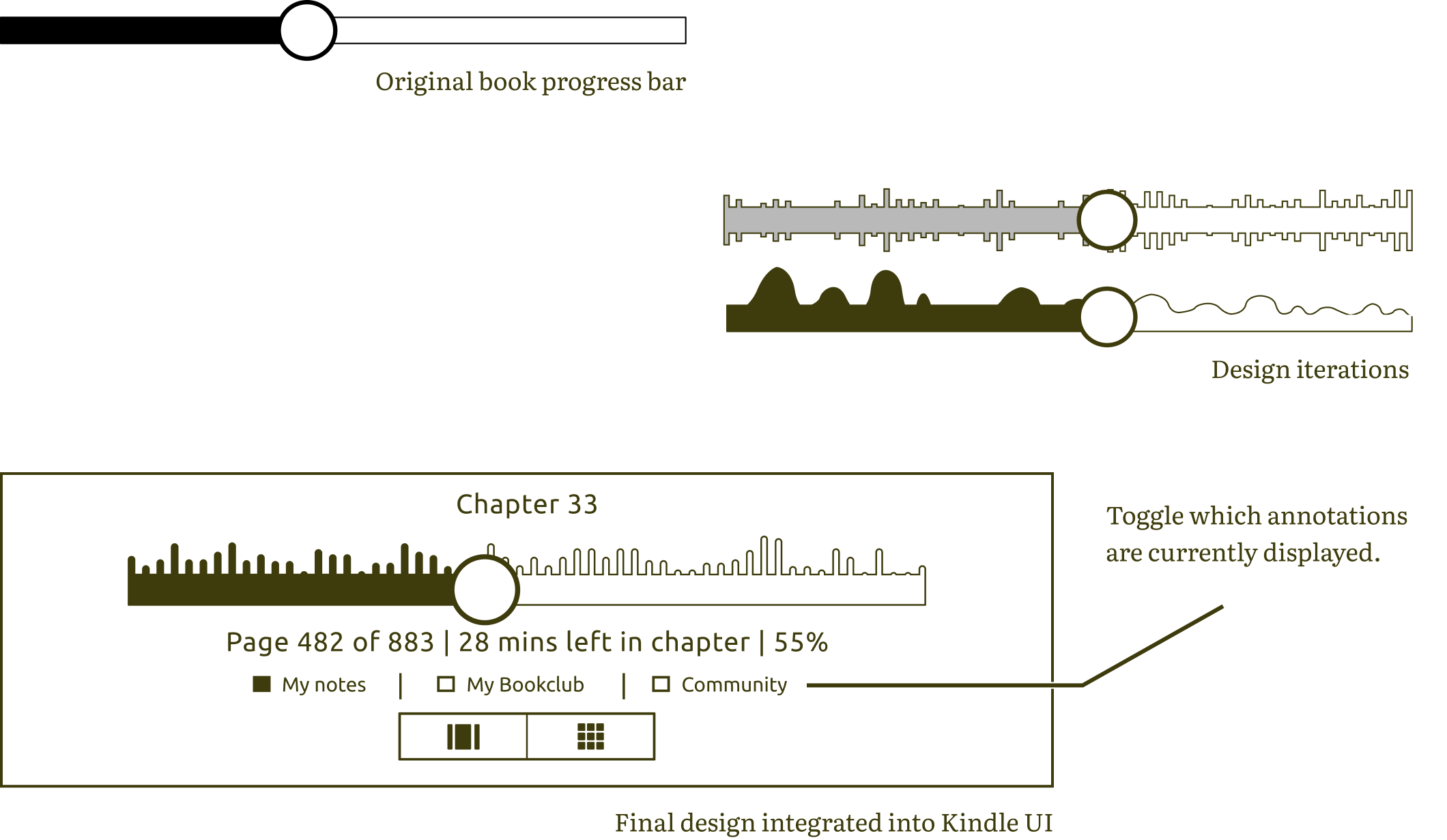
Book progess & activity bar
In an effort to keep excitement for reading high, we added an activity bar to Kindle’s native
book progress bar. This bar tells the user where they are in the book and how much is left.
Adding a visual cue as to the relative activity in a certain book section gets readers excited
about what juicy discussion is happening in the part that they haven’t gotten to yet!
Achievements & goals
Who doesn't like a challenge? Achievements and goals can be used to push group members to read just a few pages more, with the potential for incentives in the form of book discounts or other rewards.

Testing and Conclusions
In order to get a sense of how the prototype was working, we conducted seven usability
tests. We found that a majority of them could complete tasks like linking their club, making a
note and replying to a fellow club member’s note without error.
However, we noticed that users struggled with understanding and finding the book progress and
activity bar. If you recall, the bar looks something like this:

What does it all mean?! We added some checkbox toggles that indicate which group is responsible for the activity level shown. We hadn’t initially included these toggles and users were confused about exactly what metrics the bar was communicating. We went ahead and made this change to help alleviate some of that confusion, particularly as this is a large addition that we made to Kindle’s existing UI.
Next Steps

Goal Setting Let users make customizable goals for their clubs while offering some example goals to get them started.

Scheduling Related to the as-of-now unused Calendar tab on the Bookclub page. Would include features like setting recurring meetings, marking events on the calendar, and building in flexibility options for our busiest users.

App/Website Integration Build out how some of this functionality would exist on the Kindle website itself. (e.g. what would creating a new Bookclub, like we saw in Paulo’s prototype scenario, look like on the Kindle website?)

Challenges and Gamefication Drive engagement by letting users challenge others to read more they they have, or by completing a daily Kindle-generated challenge.

Achievements & Rewards We toyed with the idea of rewarding members of a club with an ebook discount. If club members have discounted access to the club’s chosen book, it will be easier to get everyone on the same page–literally.

Further Testing Ongoing user testing is needed to make sure the prototype is easy to use, free from errors, and continuing to solve for relevant user pain points.
